AlexWilMac
Moderator
It seems the "issue" I'm going to explain is not related to the skins' layout but it's generic under OBH 4.2.x.
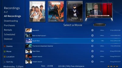
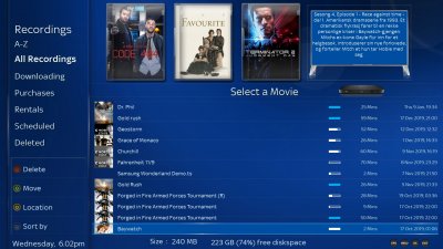
Anyway, the fact is that OBH 4.2 introduced a nice feature but also a uncomfortable one in the Recording List view (and, obviously, in any folders containing multimedia files).
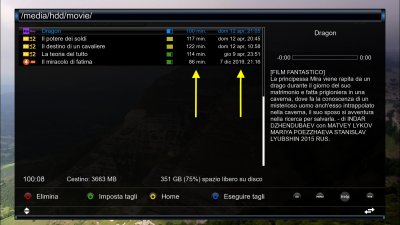
The nice feature is the chance of enabling the channel's picon you recorded from (if it was the case of a TV recording, of course).
OBH has always lacked of the extended infos (about the channel) BH has.
Now, at least, we can see the picon and this is very good.
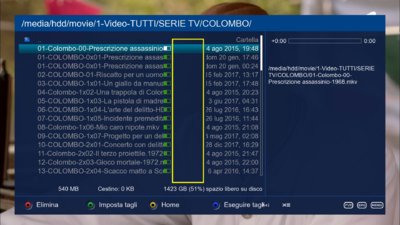
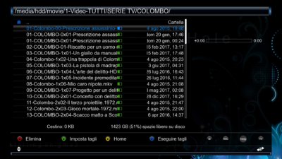
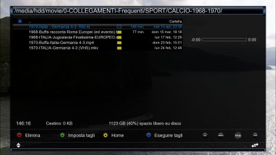
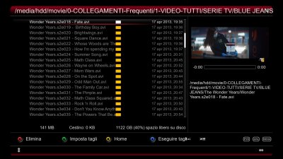
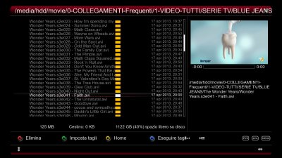
But the not comfy new feature in the lists' layout, I think, is that we have a field, a column we can't disable, for the viewing status. Next to the right... a blank field, without any infos.
This shorten the space for the titles, unfortunately and this does not depend on skins: it's general.
The fact is that, not only it'd be comfortable to disable one or more fields (date, recording status and this blank field) but also move, for instance, the status icons as 2nd field, next to the channel one in order to leave space after the filename.
So, will it be possible to suggest to the coders to add options to:
1) individually enabling/disabling the fields?
2) remove this blank, empty field?
Thanks for the attention.

