Install the app
How to install the app on iOS
Follow along with the video below to see how to install our site as a web app on your home screen.
Note: This feature may not be available in some browsers.
- Home
- Forums
- Black Hole (Archive)
- Blackole Support (Discontinued)
- Black Hole Supporto Italiano
- Vu+ Skins & Bootlogos
You are using an out of date browser. It may not display this or other websites correctly.
You should upgrade or use an alternative browser.
You should upgrade or use an alternative browser.
La mia prima SKIN
- Thread starter Majika
- Start date
Matrix10
Administrator
Eragon
Vu+ User+++
Indeed there would be some options to change in a skin.xml file, relating to the image used to draw the vertical scrollbar and the colors used by the channel list.Well spoted !! I was crazy trying to understand how he could do this nice scrollbar!!
everything else seems to be doable.
Extract from the modified skin I use:
[ITA]
In realta' ci sarebbero alcune opzioni modificabili nel file skin.xml che si riferiscono all'immagine usata per disegnare la scrollbar verticale e i colori utilizzati dalla channel list.
Tratto dalla skin modificata che uso io:
Code:
<screen name="ChannelSelection" .......>

  <ePixmap pixmap="MX_X1_E/menu/scroll.png" position="818,67" size="22,392" zPosition="4"
  alphatest="blend" />

  <widget name="list" position="60,62" size="783,396" scrollbarMode="showOnDemand"
  enableWrapAround="1" foregroundColor="unbbbbbb" foregroundColorServiceNotAvail="#666666"
  colorEventProgressbarSelected="#ffffff" colorServiceDescription="#7f7f7f"
  colorServiceDescriptionSelected="#fee2a0" serviceItemHeight="33"
  serviceNumberFont="Regular;22" serviceNameFont="Regular;24" serviceInfoFont="Regular;22"
  selectionPixmap="MX_X1_E/menu/button780x31.png" transparent="1" />

</screen>Indeed there would be some options to change in a skin.xml file, relating to the image used to draw the vertical scrollbar and the colors used by the channel list.
Extract from the modified skin I use:
[ITA]
In realta' ci sarebbero alcune opzioni modificabili nel file skin.xml che si riferiscono all'immagine usata per disegnare la scrollbar verticale e i colori utilizzati dalla channel list.
Tratto dalla skin modificata che uso io:
Code:<screen name="ChannelSelection" .......> <ePixmap pixmap="MX_X1_E/menu/scroll.png" position="818,67" size="22,392" zPosition="4" alphatest="blend" /> <widget name="list" position="60,62" size="783,396" scrollbarMode="showOnDemand" enableWrapAround="1" foregroundColor="unbbbbbb" foregroundColorServiceNotAvail="#666666" colorEventProgressbarSelected="#ffffff" colorServiceDescription="#7f7f7f" colorServiceDescriptionSelected="#fee2a0" serviceItemHeight="33" serviceNumberFont="Regular;22" serviceNameFont="Regular;24" serviceInfoFont="Regular;22" selectionPixmap="MX_X1_E/menu/button780x31.png" transparent="1" /> </screen>
Thanks Eragon - can you post a screenshot how it looks like?
Eragon
Vu+ User+++
My slightly modified skin still uses the standard layout of the channel selection list, so nothing special to show.Thanks Eragon - can you post a screenshot how it looks like?
However I pointed out you that you could likely get the result you asked for using some XML skin programming:
Vertical scroll bar: it is drawn by a png:
Code:
 <ePixmap pixmap="MX_X1_E/menu/scroll.png" position="818,67" size="22,392" zPosition="4"
  alphatest="blend" />
The scrollbar's thumb is drawn by the channel list widget over the scrollbar png. If you set one of the colors of the grid list
Code:
foregroundColor="unbbbbbb" foregroundColorServiceNotAvail="#666666"
colorEventProgressbarSelected="#ffffff" colorServiceDescription="#7f7f7f"
colorServiceDescriptionSelected="#fee2a0")I haven't tested by myself, so these are only my speculations...
[ITA] Se qualcuno desidera la traduzione in italiano me lo chieda che gliela posso postare.
Last edited:
My slightly modified skin still uses the standard layout of the channel selection list, so nothing special to show.
However I pointed out you that you could likely get the result you asked for using some XML skin programming:
Vertical scroll bar: it is drawn by a png:
The png consists in a vertical strip, so you could use a png with only 2 or 3 pixel width and of the desired color.Code:<ePixmap pixmap="MX_X1_E/menu/scroll.png" position="818,67" size="22,392" zPosition="4" alphatest="blend" />
The scrollbar's thumb is drawn by the channel list widget over the scrollbar png. If you set one of the colors of the grid list
the same of the scrollbar png you could probably get the desired aspect of the channel list.Code:foregroundColor="unbbbbbb" foregroundColorServiceNotAvail="#666666" colorEventProgressbarSelected="#ffffff" colorServiceDescription="#7f7f7f" colorServiceDescriptionSelected="#fee2a0")
I haven't tested by myself, so these are only my speculations...
[ITA] Se qualcuno desidera la traduzione in italiano me lo chieda che gliela posso postare.
hello - the png will only hide the original scrollbar and will not react as a scrollbar for the list.
So I think it does not work.
I tried the other colors but none is used for the scrollbar.
thanks for trying.
Eragon
Vu+ User+++
If you want to show only a vertical line as the scrollbar you could probably create a png of 22 pixel wide with a black background and a thin colored line in the middle.hello - the png will only hide the original scrollbar and will not react as a scrollbar for the list.
So I think it does not work.
Hello, is it possible to get this skin for VTI Image 6x?Ciao a tutti,
vi sottopongo la mia prima Skin (Compatibile BH 2.0.x).
Attendo commenti e, magari, qualche istruzione per poterla compilare e renderla installabile.
Il design, i font e i colori sono basati sulle Android Design Guidelines da cui ho tratto ispirazione.
PS. Chiedo scusa ai moderatori se ho sbagliato sezione.
Vi prego, in questo caso, di spostare il thread nella sez. più indicata.
Un caro saluti a tutti
Majika

What is the difference between VTI and BH (pros - cons)? I bought my VU+ duo2 with VTI on it.
Ok well - since there is no answers from the initial poster, I tried to do something and here is the result.
Only modified the main menus not all of them.
What I have done is a customization based on Matrix MX_S skin. So it is only for personal use.
You will need approval of Matrix10
What do you think?
@Matrix10 I'll send it to you if you want to share it.
Enjoy!
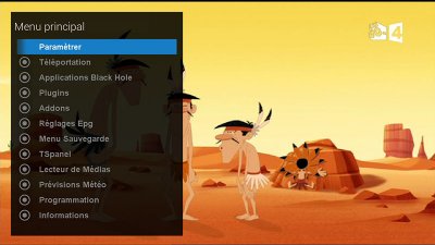
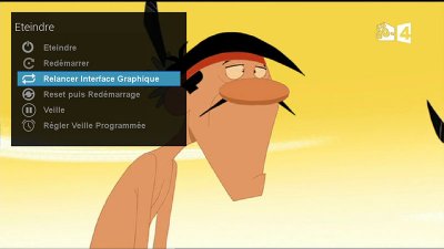
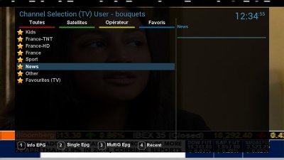
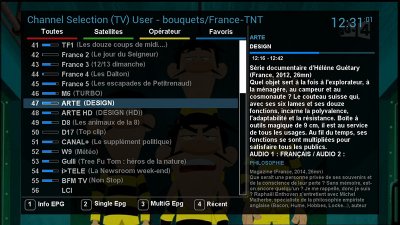
Only modified the main menus not all of them.
What I have done is a customization based on Matrix MX_S skin. So it is only for personal use.
You will need approval of Matrix10

What do you think?
@Matrix10 I'll send it to you if you want to share it.
Enjoy!


Bien, sezione Italiana, quindi in Italiano.
Le stelline gialle? Magari stesso colore del font dei menu andrebbe meglio.
Io ho sei (6) tuner - ABCDEF.
I don't speak italian so I can't answer you :-(
Sorry for posting in the wrong place, you can ask admins to remove my post.
paolino
Vu+ User+++
...come fai ad avere 6 tuner paolino?
2 Sat e 4 DVB-T
 . Sono maniaco
  .
.2 Sat e 4 DVB-T. Sono maniaco
.
 4 tuner dvb-t registri molto allora immagino dai canali terrestri


